Practically from the start, The Old Farmer’s Almanac used illustrations to attract patrons and to reinforce its agricultural and astronomical themes. It was one of the earliest publications in America to turn to the new art of wood engraving and employed the pre-eminent designers and engravers of the day.
The Plowman on the Title Page
With the exception of our very first issue in 1793, The Old Farmer’s Almanac has been decorated with a title page illustration every year of its long life. In 1794 the Plowman appeared, trailing his hefty yoked oxen—the perfect image to attract the eye of the New England farmer. A circular emblem at the top of the design—could it be a pumpkin?—is flanked by overflowing horns of plenty and assorted farm tools. It’s a hopeful scene, anticipating the harvest from spring plowing.
He who ploughs his land well,
Will have withal to eat and sell.
This verse, from the 1802 Almanac, typifies the farming advice found in the early Old Farmer’s Almanacs. The Plowman was the first of three distinct frontispieces adorning the Almanac through the years, up to the present. The sparse plowing scene suggests the style of a simple type-metal engraving, at the time a common medium for illustration. The Plowman continued ever so briefly—three years—before giving way to a more richly-designed scene that clearly has the look of a wood engraving.
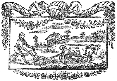
The “Plowman,” The Old Farmer’s Almanac’s very first frontispiece, 1794. Artist unknown.
The History of Wood Engraving
More complex than woodcuts, requiring precise execution of fine lines incised into a highly-polished block of wood, wood engravings were becoming fashionable with American artists, a handful of whom were just beginning to experiment with the medium in the 1790s. They wished to emulate the style of the famous English book illustrator, Thomas Bewick (1753-1828), the inventor of wood engraving.
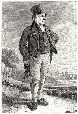
Englishman Thomas Bewick (1753-1828), inventor of the art of wood engraving.
It was Bewick who first transferred the techniques of metal engraving to the hard, creamy, end-grain surface of an extremely dense wood named boxwood. The tight grain was ideal for engraving fine lines, and the wood’s density allowed it to withstand the great pressure required in the printing process. Boxwood engravers’ blocks were custom-made to match the height of hand-set type and were clamped and inked alongside the text in the old printing presses.
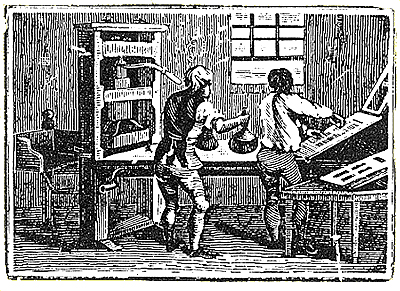
An 18th-century printer dabs ink onto hand-set type. The early Almanacs were printed by hand on this kind of press.
Ceres on the Title Page
The second Almanac frontispiece to appear—a lovely pastoral wood engraving—began a twelve-year run in 1797. A seated woman, surrounded by lush foliage and with gardening implements at her feet, extends her arm toward a field where the Plowman, still struggling with furrows, trudges on in the background. Clothed in a flowing gown, this figure is Ceres, known to our antiquity-admiring forefathers as the Roman goddess of agriculture. Her Greek counterpart, Demeter, was celebrated by Homer as the “bringer of seasons” who “made fruit to spring up from the rich lands, so that the whole wide earth was laden with leaves and flowers.”
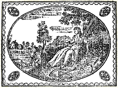
Ceres, goddess of agriculture, first appeared on the title page in 1797. Artist unknown.
According to the Greco-Roman myth, after her daughter Persephone was kidnapped into the underworld, Demeter (or Ceres) was so upset she neglected the earth, causing famine; but when she found her daughter, she struck a bargain with Hades to have Persephone returned for half the year. Demeter’s joy is reflected in the fruitfulness of the earth. When her daughter returns to the underworld, the goddess neglects the earth and winter arrives.
Ceres was re-engraved for the 1805 Almanac and, for the first time, the engraver’s identity was revealed within the design: HARRIS is carved along the right edge of the oval. Samuel Harris (1783-1810), born in Boston, was about 21 years old when he engraved this frontispiece, which continued through 1808. He followed the first goddess design closely but did make some alterations: there are fewer gardening tools; the hill in the background has become sky; and a bundle of wheat has been added under the tree—a nice touch, since Ceres was also known as the grain goddess.
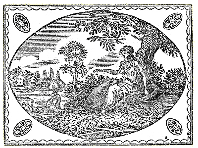
Ceres re-engraved by “Harris”—see the name in the bush at the right of the oval; 1805.
The Plowman and Ceres frontispieces reflected the spirit of independent yeomanry, celebrated the farming way of life, and emphasized the hopefulness of an abundant harvest, themes embraced by both the new republic and the Almanac.
Father Time on the Title Page
A new frontispiece design alights, with a vengeance, onto the front page of the Almanac in 1809. Father Time, most likely a biblical representation, was meant to convey a harsh warning to readers: God’s wrath is pouring out onto the land; reform your wicked ways, for He is not pleased and the time of judgement is at hand!
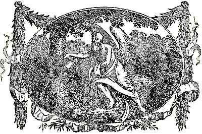
Father Time; 1809.
The role of this angel, his emptying of the urn, and the scythe or sickle at his feet all have their origins in the Bible, the one other publication besides an almanac found in virtually every early American household.
Almanac readers were surely familiar with this stern theology, coming at a time when ministers and their churches were condemning what they perceived as the excesses of post-revolutionary America: the abuse of alcohol, and a general laxity in morals and industriousness.
Engraver Alexander Anderson (1775-1870), whose initial “A” is cut into the new 1809 Father Time frontispiece, was born in New York City, raised in a religious family, and taught himself engraving.
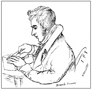
From his own diary, we learn that Anderson made his first wood engravings in 1794. His talent for engraving human figures, his successful copying of Thomas Bewick’s artistic style, and his long and prolific career as an illustrator earned him the title, “Father of American Wood Engraving.” Anderson’s early reputation rested on an 1804 American edition of a Bewick natural history book. In it, he copied over 300 of Bewick’s wood engravings. For the Almanac’s new frontispiece, Anderson may have been inspired by an earlier Bewick engraving of an avenging angel, which shows a bearded and robed figure flying through the air, scythe and hourglass in hand, while below him lies a devastated landscape. Proof of Father Time’s popularity as a symbol can also be found in his numerous appearances on gravestones of that era.
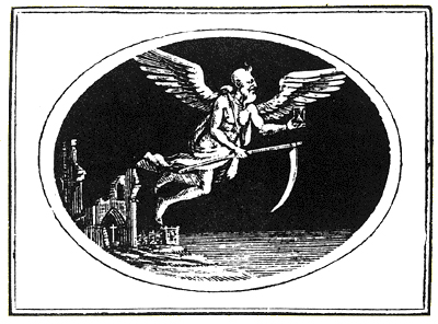
Bewick’s Father Time may have been a model for Anderson’s engraving.
Father Time continued to warn Almanac readers—of a different kind of harvest for the next 190 years, up to the 1999 issue, although he was re-engraved several times by different wood engravers. Abel Bowen (1790-1850) cut a version in 1819 that closely followed Anderson’s design, and included his own initials, “AB.” Bowen was Boston’s first wood engraver, setting up shop there in 1812, and his rendering of the angel, if not as skillful as Anderson’s, achieves an overall pleasing contrast in black and white. Bowen subsequently engraved another Father Time for the 1823 Almanac, this one more stylized and with even sharper contrast. The urn and the scythe are more clearly rendered, and the angel’s expression, more than ever, conveys a kind of dreadful seriousness.
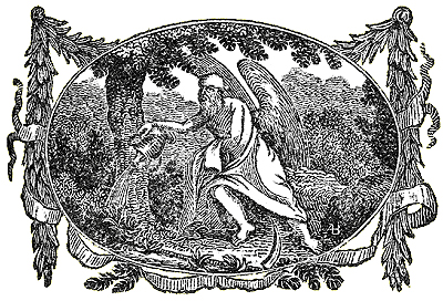
Bostonian Abel Bowen’s version of Father Time appeared in 1819. His initials “AB” are at the lower right of the engraving.
In 1852, six years after the death of founding editor Robert B. Thomas, the Almanac prepared readers for a change:
“For about forty years past, we have used, upon our Title-page and Calendar-pages, wood-cuts or engravings done when the art of engraving was not as advanced as now; but as time, the press, and constant use have worn down the surface of the cuts, we intend, in our next number, to insert new and better engravings of the same subjects, which we hope will please all.”
True enough, in 1853 yet another angel appears. The editor tells us, “but though ‘Father Time’ may be burnished up, and improved in his outward adornings, his heart is in the right place, and we trust that we shall never forget the good old times of ‘Lang Syne’, that we have had together.” This engraving was designed for the Almanac by Bostonian Hammatt Billings and engraved by Henry Nichols of Cambridge. Hammatt Billings (1818-1874) learned how to engrave on wood from Abel Bowen, but he is best known as a draftsman whose designs were engraved by others. Billings earned fame as the illustrator of the original American editions of Uncle Tom’s Cabin (1852) and Little Women (1869), as well as numerous children’s books, some of which were also collaborations with Nichols.
Billings created a noble-looking Father Time, like Zeus on his throne, that conveys a mellower message than the stern angel of old. He is now shouldering the scythe and at his side has been added a small hour-glass (with miniature wings!) to show that time is ever-eroding. The 1853 issue of the Almanac sold well, thus in 1854 the editor happily offered this explanation to readers:
“We thank you for appreciating the efforts we made last year, by furnishing new engravings, to improve our work; and, as its circulation has largely increased thereby, we have a practical demonstration that our improvements are valued.”
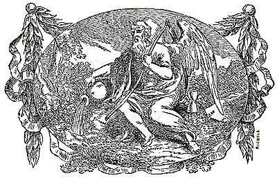
Hammatt Billings designed this 1853 Father Time, which was engraved by Nichols.
In choosing Hammatt Billings for the new artwork, the Almanac recognized a major mid-century American talent. Billings’ noble Father Time adorned the Almanac right up through the 1978 edition, after which it was replaced by the earlier Abel Bowen engraving.
Ceres Reappears on the Cover Page
The Almanac’s commission of a new frontispiece for its 2000 edition closes the circle: artist Randy Miller has based his new design on the Almanac’s 1797 portrait of Ceres. Miller used the very same technique of wood engraving that was employed over two hundred years ago. He paid homage to the earlier Roman version for both historic and aesthetic reasons.”The founding fathers and early inhabitants of America looked to Greco-Roman mythology for inspiration,” said Miller. Reviving the image imbues his engraving with a fitting spirit of continuity.
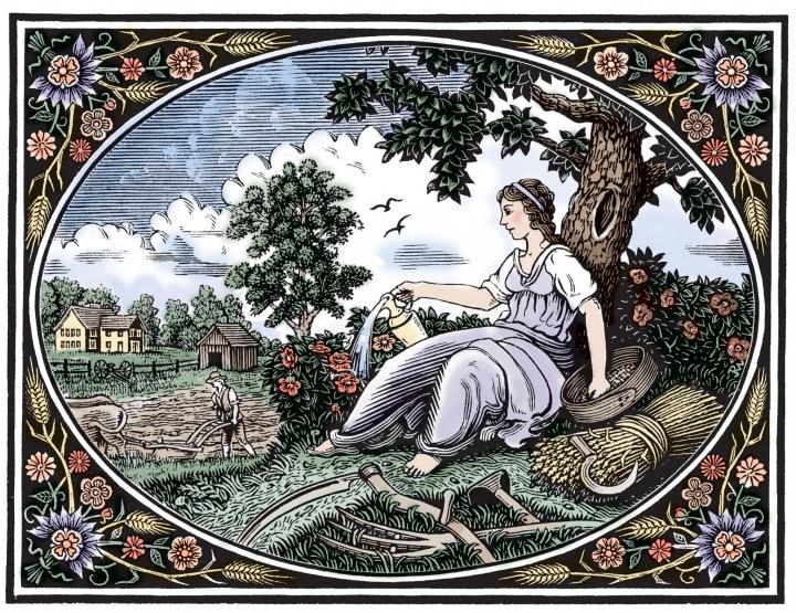
Father Time was used for 190 years until the year 2000, when it was replaced with this engraving of Ceres by Randy Miller, who was inspired by an 18th century Almanac engraving
That’s not to say, however, that he didn’t make some changes. The Almanac’s eighteenth-century version of Ceres, said Miller, is somewhat blockier than his own. In general, he opted for greater curvature of line and fuller detail.
In her previous incarnation, which Miller had opportunity to study at the Almanac’s archives in Dublin, New Hampshire, the goddess stands beneath a tree gesturing charitably toward a farmer at work in the field. At her feet are various farming implements. In Miller’s version, Ceres, still beneath a tree amidst hoes and sickles, pours water from a pitcher onto a flowering bush. The flow of her gown, said Miller, is more pronounced. Miller also added numerous cosmetic touches to the embroidery that frames the central figure.
It took Miller approximately three months to complete the engraving, he said. Considering the Almanac’s manifest reverence for tradition, his work will grace its title page for a good deal longer than that.
Related Articles
Part II: Right-Hand Calendar Pages
Part III: Front Cover of The Old Farmer’s Almanac


Comments